How the Art Style for Spirits evolved
Spirits is an action-strategy game where you help a tribe of leaf-shaped spirits to reach their final destination. To do this you manipulate the wind or build and destroy elements of the levels. This blog post will explain the decisions and thoughts that lead to the final art style of Spirits, and how this process also influenced parts of the game design.
At our first meeting Mattias showed me an early prototype he had designed. The general idea was a Lemmings-like game with ants walking on leaves and sticks. We both liked the natural setting but wanted to have a more fairy-tale like atmosphere and character. At that time I was still illustrating Andreas' experimental game series The Black Forest which has a very abstract representation of a ghost as an avatar. It was just a rectangle with two dots as eyes. Initially I wanted to make this abstract character more lively, but it didn't fit the concept of The Black Forest. Instead I took my ideas and applied them on Spirits.
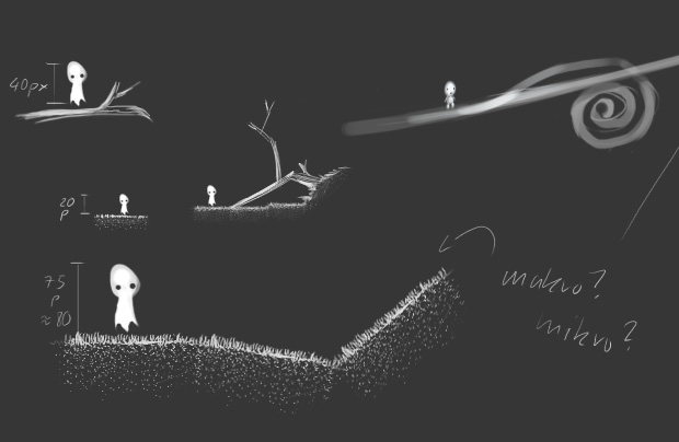
Before I could start designing the character, we had to decide on the proportions of the characters and the game world. How big should the character be in terms of pixels? Due to technical limitations of the iPhone we initially decided to use a sprite sheet of 512 × 512 pixels. The bigger the character would be, the fewer frames I could use for the character animation. But if I made the character too small the game would loose atmosphere and important details.
I sketched some sizes and we decided on 48 × 48 pixels which looked and felt good. But I proceeded to paint all the character states in 72 × 72 pixels, since it was only slightly more work and gave us more flexibility in case we changed our mind. However, after a while this still felt limiting and we decided to allocate even more graphics memory to the main character.
Already early on, I tried to capture a spooky atmosphere in the sketches. I drew the overall light situation quite dark with a point light source from behind and a weak bounce light hitting the front. This means most of the area beneath the ground is an even dark color, which draws the players attention to the ground surface where the spirits walk.
Later on we added a strongly blurred and colorful background to make the atmosphere feel less dark and more mystical, but the overall style of Spirits is still based on these early sketches and this lightning setup.
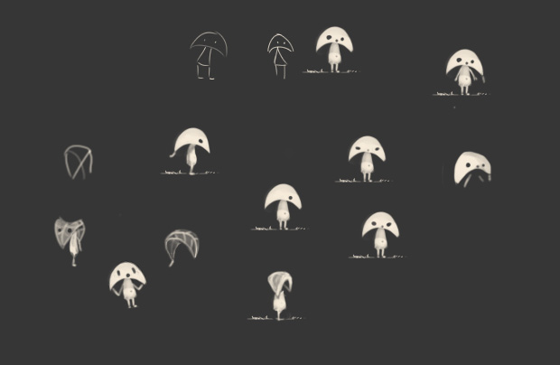
After the style and the proportions were roughly set, I began to sketch some more characters. I had the idea that the characters could be sleepwalking. This would explain why they would always wander heedlessly in one direction. At first this seemed great, but after trying it out it felt too artificial and not the direction we wanted to keep working in.
Another idea was born out of my love for insects. There are these amazing insects which mimic leaves and sticks for camouflage. Since the spirits inhabit the forest, I thought about the possibility that they could have adopted to the forest environment and therefore look more like leaves. I sketched this idea down quickly (see the lower right corner).
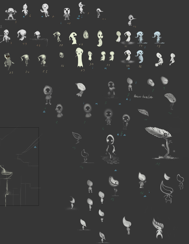
We further developed this idea and ended up with a character with a big leaf as a head, without arms but having legs. Because of the general ghostlike look of the sketches the character seemed like a spirit, which rises from a fallen leaf. This is what it ultimately became for us.
The character design influenced an important aspect of the game design. We knew from the beginning that we wanted to have a more dynamic component in the game, which influenced the spirits in some way. We were thinking about fluids and gas at first, but the leaf-like spirit character inspired us to use wind instead.
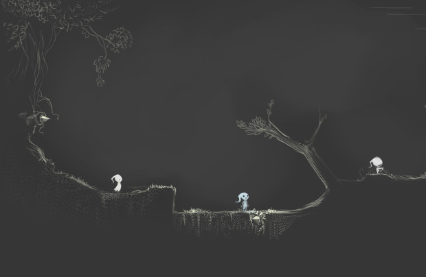
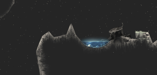
While I developed the character I also sketched the backgrounds. We wanted to have them in a painted style, but also create a lot of levels without using huge amount of memory. To do this we use small tiles and shapes that are put together into levels. So basically I painted a lot of small elements which we could put together in various ways. This worked well because of the flexible level editor we developed at the same time. The image below shows an early level which we used to test this process.
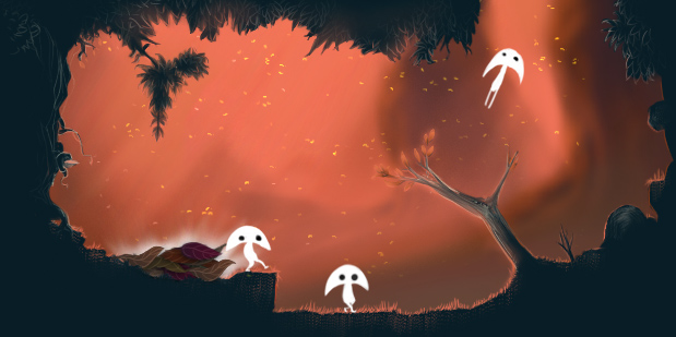
As mentioned before we wanted the atmosphere to feel less dark, so color was added to the backgrounds. I wanted the light to appear as if the viewer looks into the sunset through a dense forest. The viewer wouldn't see direct sunlight, only bounce light, illuminated fog and trees.
I made a quick sketch to figure out the color values. The bounce light in the foreground was reduced in strength to emphasize the effect of looking directly into the sunset.
Then I made the same thing again with abstract shapes and without distracting details.
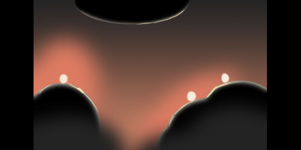
The strong orange color in the background makes the overall atmosphere friendly but the dark blue (no it's not black!) ground color keeps the spooky and dark touch to it. We liked this approach and so we decided to go with it.
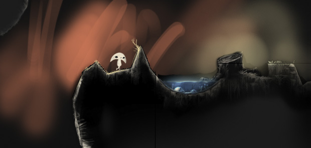
Below you can see the final art style we are using for Spirits.